Post by Maruno on May 18, 2008 21:59:09 GMT
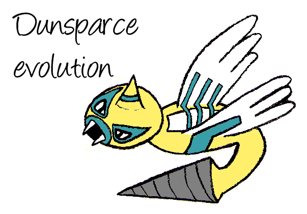
Say hello to my little friends. They're all related to existing ones, because they're easier to draw (basing it off an existing design, as opposed to creating a new one).
My scanner makes any pencil lines appear a lot lighter, and I've had to make do with that in the past. Now, though, I've found in Paint.NET a function called Auto-Level, which apparently normalises the colours (the darkest of the greys is set to black), which really makes the pictures appear. To see the improvement, check out Absol's prevolution pictures.
Once I did that, I went round with the paintbrush getting rid of extraneous lines, which is a great for procrastination.

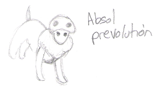
Isn't it cute? It's hard to draw a baby dog-like creature without making it look like a generic puppy. The skull helps to distinguish it.
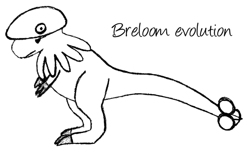
I really like this design, particularly the shape of the head. Hard to believe it's related to a mushroom (Shroomish). Breloom always seemed to be missing an evolution, for no good reason. How does the name Loomaxi sound?

More work could be done on the body, I think. The ring of chimes isn't connected to the rest of the body, just centred around the spike. Well, it's a fairy creature, so I figured that would be allowed. Besides, now it can learn Rapid Spin.
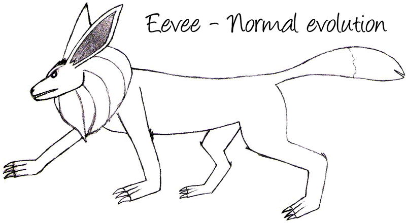
Fearsome. And note the ruff, which should clearly be on all Eevee evolutions (stupid new designs).

Simple yet effective. There's no reason for Rotom not to have an evolution - it really looks like it should. I call it Elasma.

Probably the first one I drew, a while ago. Some may argue it's already a powerful monster (it's got the highest DEF of any pokémon), but I don't care. He's called Turckle.

It's not exactly difficult to draw a letter with a circle in it somewhere, I know, but I've done so anyway. A couple more letters (Greek this time), and something special (infinity/DS9-style). Wasn't really happy with the DS9 one, so I've just left it.
My scanner makes any pencil lines appear a lot lighter, and I've had to make do with that in the past. Now, though, I've found in Paint.NET a function called Auto-Level, which apparently normalises the colours (the darkest of the greys is set to black), which really makes the pictures appear. To see the improvement, check out Absol's prevolution pictures.
Once I did that, I went round with the paintbrush getting rid of extraneous lines, which is a great for procrastination.
Isn't it cute? It's hard to draw a baby dog-like creature without making it look like a generic puppy. The skull helps to distinguish it.
I really like this design, particularly the shape of the head. Hard to believe it's related to a mushroom (Shroomish). Breloom always seemed to be missing an evolution, for no good reason. How does the name Loomaxi sound?
More work could be done on the body, I think. The ring of chimes isn't connected to the rest of the body, just centred around the spike. Well, it's a fairy creature, so I figured that would be allowed. Besides, now it can learn Rapid Spin.
Fearsome. And note the ruff, which should clearly be on all Eevee evolutions (stupid new designs).
Simple yet effective. There's no reason for Rotom not to have an evolution - it really looks like it should. I call it Elasma.
Probably the first one I drew, a while ago. Some may argue it's already a powerful monster (it's got the highest DEF of any pokémon), but I don't care. He's called Turckle.
It's not exactly difficult to draw a letter with a circle in it somewhere, I know, but I've done so anyway. A couple more letters (Greek this time), and something special (infinity/DS9-style). Wasn't really happy with the DS9 one, so I've just left it.